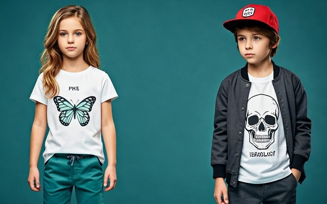
5 Design Mistakes That Ruin Custom T-Shirts (And How to Avoid Them)
You’ve got a great idea for custom t-shirts. Maybe it’s merch for your band, branded gear for your wrestling persona, or a new design you’re testing as a reseller. But here’s the hard truth: a bad design can kill even the best concept.
After 28 years in the printing industry, I’ve seen countless designs that looked amazing on screen but failed miserably on fabric. The good news? Most design mistakes are easy to avoid once you know what to look for.
Whether you’re working on custom t-shirt design in Calgary or anywhere else, here are the five biggest design mistakes that ruin custom t-shirts—and how to fix them.
1. Low-Resolution Images (The Pixelated Nightmare)
The Mistake: Using images pulled from Google, Instagram, or screenshots that look fine on your phone but turn into a blurry, pixelated mess when printed on a shirt.
Why It Matters:Direct-to-Garment printing requires high-resolution files to produce sharp, professional results. Low-resolution images (anything under 300 DPI at print size) will look fuzzy, unprofessional, and cheap.
The Fix:
- Always use 300 DPI images at the actual print size (typically 12″x16″ for a full chest print)
- Use vector files (AI, EPS, SVG) whenever possible—they scale infinitely without losing quality
- If you only have a low-res image, consider hiring a designer to recreate it properly
Pro Tip: Before you finalize your custom t-shirt design in Calgary, zoom in to 100% on your computer screen. If it looks blurry there, it’ll look worse printed.
2. Ignoring Fabric Color and Type
The Mistake: Designing without considering what color or type of shirt you’re printing on. White text on a light gray shirt? A detailed photo on a dark polyester blend? Recipe for disaster.
Why It Matters: Ink behaves differently on different fabrics and colors. Light colors need underbase layers on dark shirts, and some fabrics (like polyester) work better with DTF printing than DTG.
The Fix:
- Design for your fabric: If printing on dark shirts, avoid super-fine details and light colors without proper underbase
- Know your material: Cotton works beautifully with DTG; polyester shines with DTF
- Test contrast: Your design should have strong contrast with the shirt color
Pro Tip: Always ask your printer (like us!) which printing method works best for your chosen fabric and design combo.
3. Overcomplicated Designs
The Mistake: Cramming too much text, too many colors, or overly intricate details into one design. More isn’t always better.
Why It Matters: Busy designs are hard to read from a distance, lose impact, and can look cluttered or amateurish. According to Printful’s design guide, the best-selling custom apparel features clean, bold designs that communicate instantly.
The Fix:
- Simplify: Stick to 1-3 main colors and one clear focal point
- Readable text: Use fonts that are bold and legible (minimum 12pt for body text)
- White space is your friend: Give your design room to breathe
Pro Tip: Step back 10 feet from your screen. Can you still “get” the design? If not, simplify.
4. Ignoring Print Placement and Size
The Mistake: Designing without thinking about where the print will actually sit on the shirt—too high, too low, too big, or awkwardly placed.
Why It Matters: A design that’s too large overwhelms the shirt; too small looks cheap. Poor placement (like a design that sits right at chest level on women’s shirts) can be uncomfortable or unflattering.
The Fix:
- Standard chest print: 12″x16″ centered about 3-4 inches below the collar
- Left chest print: 3-4 inches, positioned like a pocket
- Full back print: 12″x16″ centered between shoulder blades
- Consider your audience: Design placement should flatter the wearer
Pro Tip: Use a design template or mockup tool to visualize placement before printing.
5. Forgetting About Licensing and Copyright
The Mistake: Using copyrighted images, logos, fonts, or artwork without permission. “I found it on Google” isn’t a legal defense.
Why It Matters: Copyright infringement can result in cease-and-desist letters, legal action, and destroyed inventory. It’s not worth the risk.
The Fix:
- Create original artwork or hire a designer
- Use licensed or royalty-free assets from sites like Creative Market, Adobe Stock, or Unsplash
- Get permission if using someone else’s work
- Check font licenses: Some fonts are free for personal use but require a commercial license for apparel
Pro Tip: When in doubt, ask. A quick email to a font designer or artist can save you thousands in legal fees.
Bonus Tip: Work With an Experienced Printer
The best way to avoid design mistakes? Partner with a printer who knows what works.
At DTG Printing Corp, we’ve been perfecting custom t-shirt design in Calgary for nearly three decades. We’ll review your artwork, flag potential issues, and help you optimize your design for the best possible print quality—whether you’re using DTG or DTF printing.
Ready to bring your design to life?Submit your order today or contact us for a free design consultation.